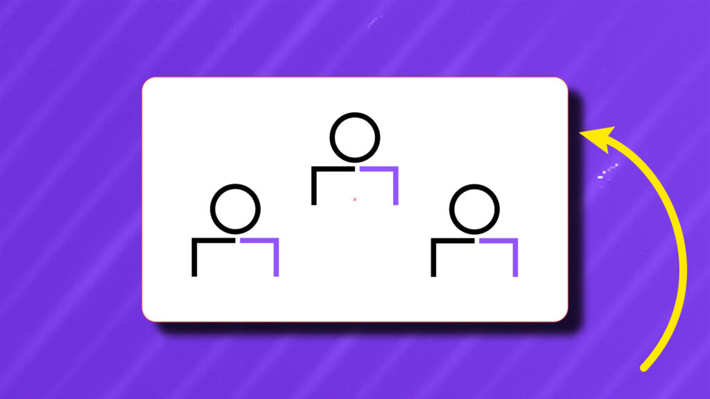
GoTo Motion Guidelines
- Creative Fields Motion
The GoTo Brand is exciting and empowering, and we want to convey those feelings in motion. We move quickly and clearly through the message, and pacing should give enough information at the right time —without rushing or lagging.
Use basic animation principles like anticipation, overshoot, and overlapped timing to help us guide the eye along the animation and story. Breathe life into rigid forms by continuing motion in a subtle way. However, do not overdo it — avoid cartoonish exaggeration. Aim for more than simple motions like fading elements in or scaling up illustrations. Finesse your motion curves to give nuanced, realistic easing to shapes and objects that bring to life the GoTo brand.
There are no strict rules; however, we have created guardrails to keep in mind when animating, be creative, and try new technics. Remember, the story is key, and the animation should support that. Keep it simple and fluid.

How elements move depends slightly on what the element is. Photos and shapes can scale, change opacity, and rotate in a manner best fitting for the space following guidelines.
The timing and duration of the animation can depend on the size of the elements and the distance it covers. Movement, scaling, opacity, and rotation can be combined to create a more dynamic experience.
There is the freedom to layer images, shapes, and assets to form complex movements but try to keep a clear-cut sequence to keep the focus on the essential message and how each animation can connect to the next moment. The animation should complement each other and not compete.


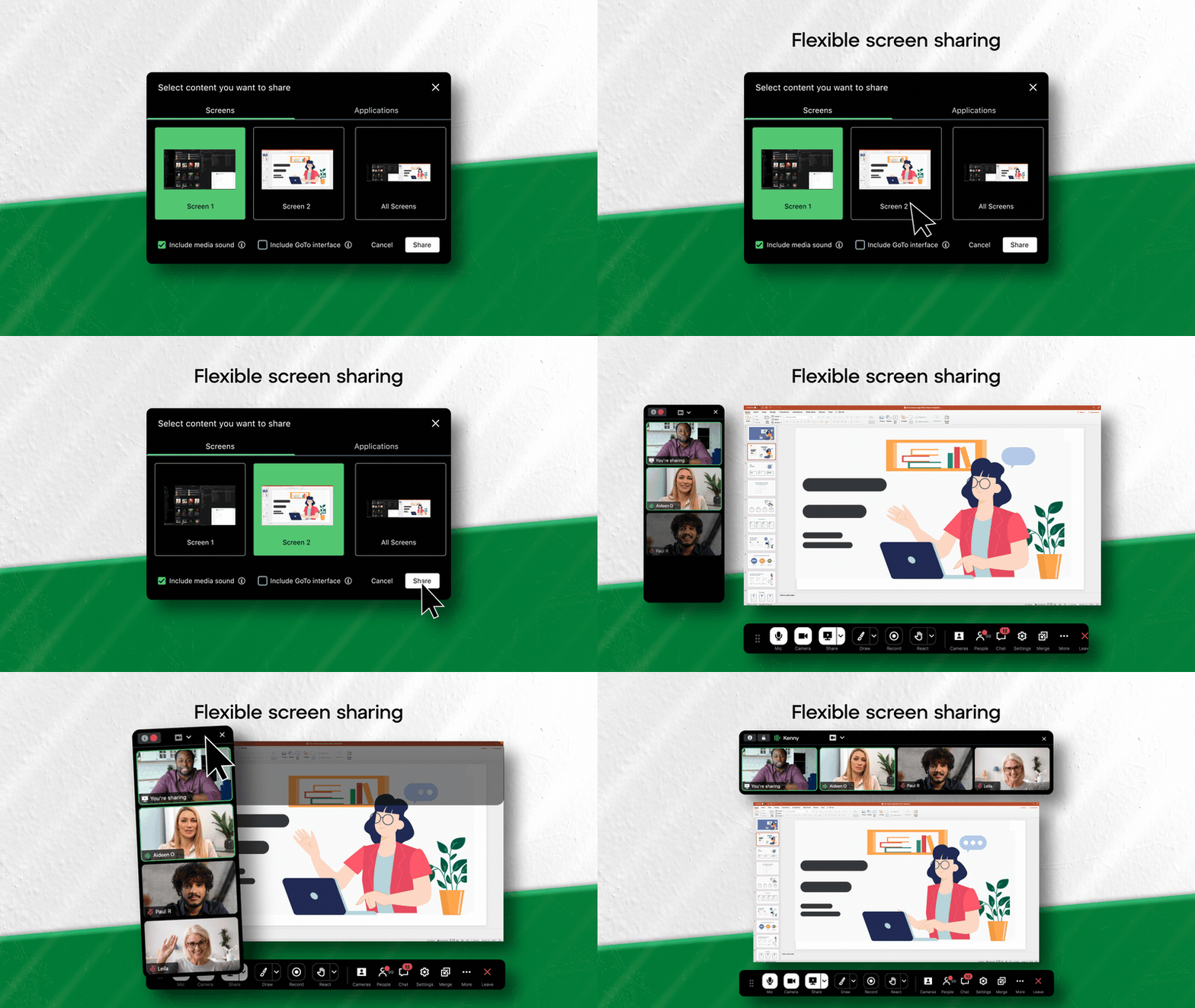

The GoTo Shapes can be used in unlimited ways. The main thing to keep in mind is to have consistency across the animation.
When shapes are placed behind a subject, be sure the shapes do not obstruct the face or significant action in the video.
The use of 3D shapes is also encouraged when fitting into the story and animation style. Aim to make the shapes feel they belong and are not an afterthought. See the 3D section for more info.


Find opportunities to move the images and videos so it feels fresh and exciting. Use a slow, subtle speed ramp between big movements to continue the motion.


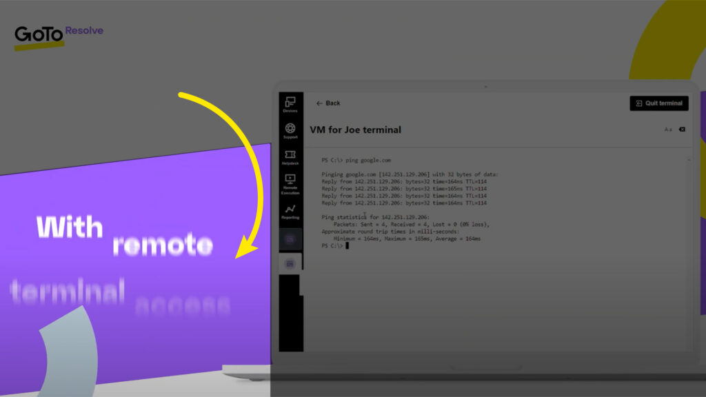
When animating text, it is ok to animate individual letters in words, separate words in a sentence, and lines in a paragraph. However, be cautious not to overdo text animation. For example, if a simple fade-in works to tell the story, go with that. Here are a few keys to keep in mind:
- Typography animation should feel effortless and smooth.
- When animating text, feel free to animate each line, word, or letter in a way fitting for the text’s length. However, the longer the text, the less animation should happen.
- When animating text, always be sure there is time to read. The animation should never hinder viewers from understanding the message.
- When animating supers to voice-over, be mindful of matching speed and cadence.


The use of 3D elements is encouraged when fitting and supporting the story. Elements like laptops, shapes, and environments bring an elevated level of detail and richness and should remain consistent with the previous animation.


Icons should be simple, fluid, and not overly animated.


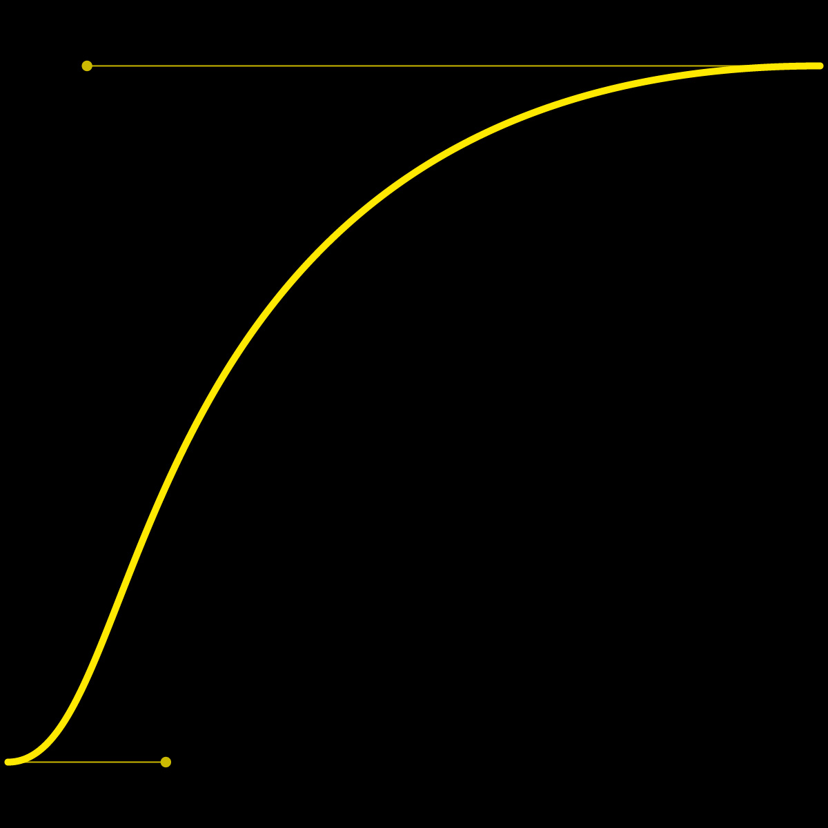
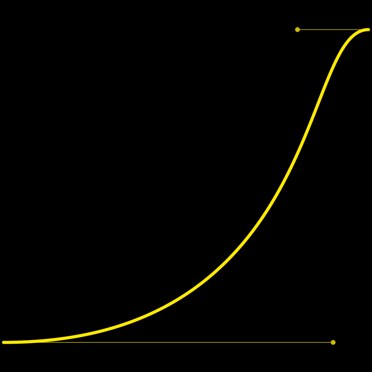
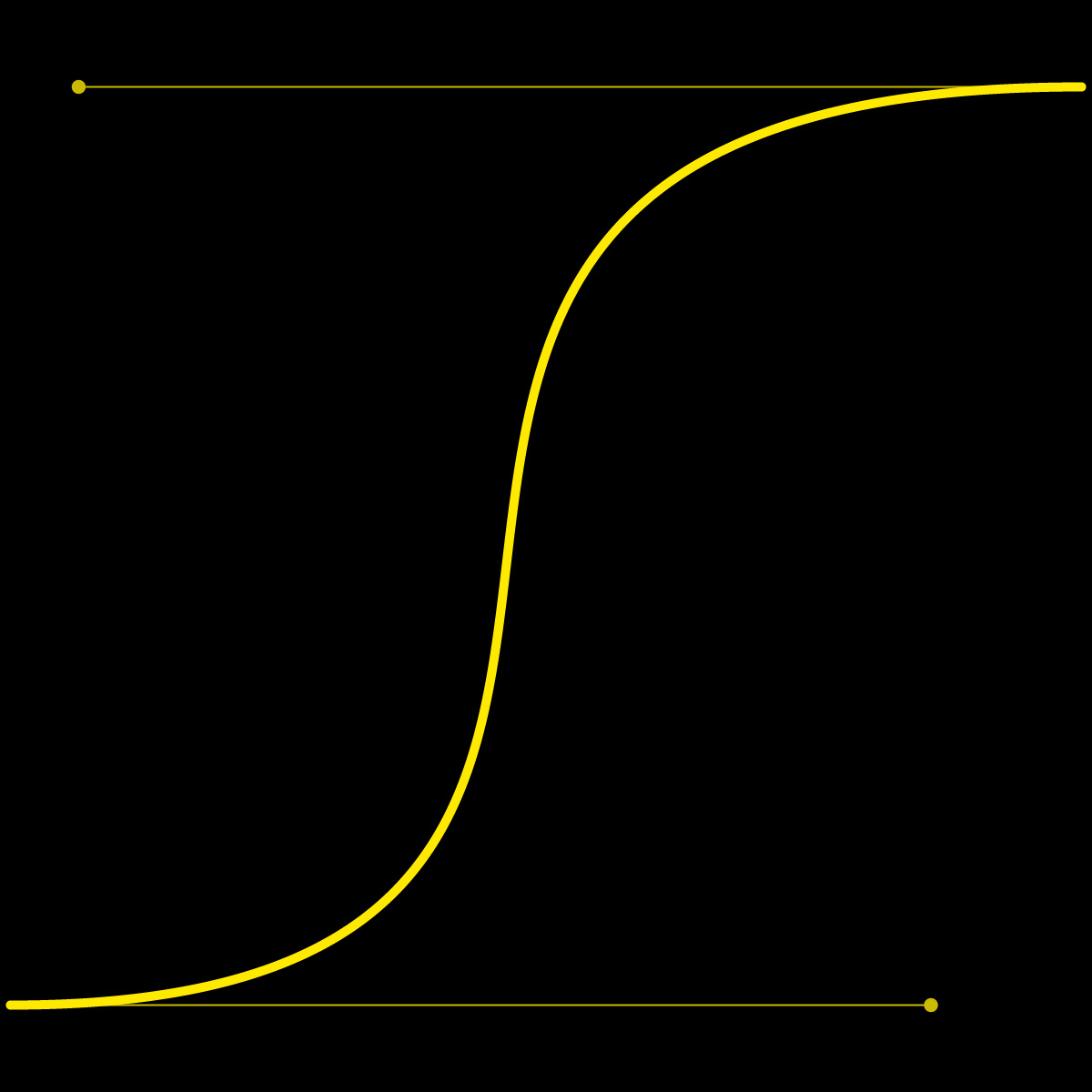
Adjusting the animation curves helps bring life into stale animations. Try to fineness the curves to bring a fluid motion. Below are some defaults to definitions for motion curves in Adobe After Effects. But you are not locked into these. Remember to create a fluid animation that supports the message.
| Entrance easing for assets coming on-screen. | Exit easing for assets going off-screen. | Moving assets going on screen from one position to a new position |
| Outgoing Velocity: 20% Incoming Velocity: 90% | Outgoing Velocity: 90% Incoming Velocity: 20% | Outgoing Velocity: 40% Incoming Velocity: 90 |
 |  |  |
 |  |  |

- Do not use a drop shadow under images or shapes.
- Do not add motion blur.
- Do not rotate on odd angles that feel jarring. Instead, use a smooth sweeping arch.
